Recreating a legacy product experience
GE wanted to convert their popular “portable ultrasonic flowmeter” device from a legacy stand-alone display to an app on a Samsung tablet.
This flowmeter worked with physical transducers to take measurements of fluid flowing through pipes at industrial sites. Our team was asked to translate the legacy screens to the new tablet display, and restructure the architecture for a better user experience.
The Problem
GE had created an LCD display device that had been used in the field for over 10 years. The device was bulky, with a small screen that could only be programmed with physical buttons and it took around an hour to set up a measurement.
The Goal
We wanted to translate the setup process into a workflow that was faster and easier to use, and update the output screens to be readable and understandable in an industrial environment.
My Responsibilities
The core design team consisted of me and a principal designer. I co-creating the new architecture and led the visual design of the application.

Uncovering issues with the current device
Our research team conducted 50+ user interviews across 20 sites across the US and the UK to understand how the current device was being used, by whom, and in what environment. Here were some of the key findings:
Device issues
Screen lacks clarity/ lighting conditions and angles can be challenging
Backlight lacks power
Data exchange is laborious
Small screen is challenging to see
Laggy screen response
Users have to remember inputs from screen to screen
What users wanted
Automated workflow for repeatability
Different levels of complexity available for different user types
More plug and play functionality
The Users
The research team identified 4 user types who have different needs and goals when using this tool.
With a wide range of feature usage and variety of tasks, it was clear that in our redesign we would allow advanced users to access advanced functionality, and create a simplified workflow for more basic users.
Discovery
We set up a fluid measurement station in our office, where we explored the set up process and capabilities of the legacy device. We mapped out all of the existing task flows, gathering requirements of what we needed to include and what we could leave out of the new touchscreen architecture.

Creating workflows for two user groups
The structure of the new app was built around the most frequently used functions and simplest task flow, making it easy for users to set up a basic measurement, but also flexible enough to easily allow advanced users to access more complex functionality.
Exploring Navigation Options
One of the early wireframe explorations was choosing a navigation structure. We wanted this to be intuitive and easy to access but also not intrusive or distracting to the setup process. Here are different iterations we tried on the measurement screen, from persistent navigation options to hamburger menus.
Top level wireframes
We created an architecture that made setting up a measurement more intuitive by organizing information in chunks and always showing the user where they were in the process. We also designed fields to dynamically change based on the user’s selections, and auto-saved their progress to streamline setup.
Visual design iteration
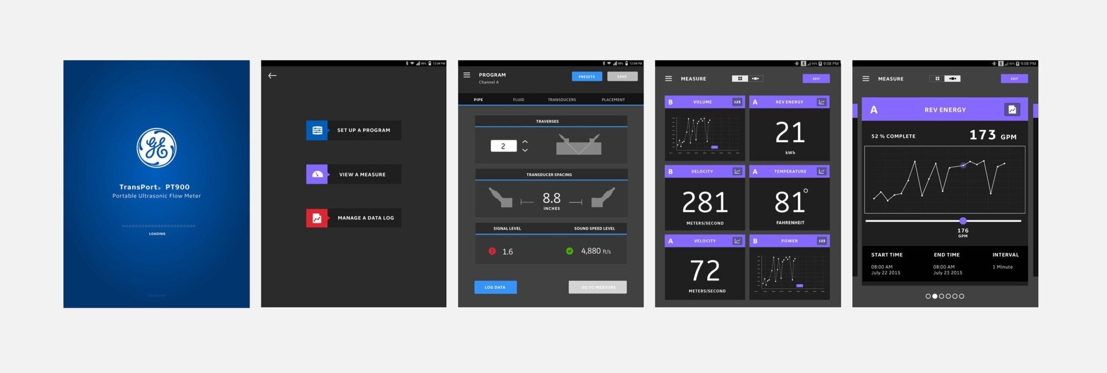
Because this tool is used in environments that are unpredictable in lighting, space and maneuverability, I explored high contrast color palettes within GE brand guidelines to make entering and reading data easy.

Final Visual Design Screens
For the final UI design, I color coded each section so that users could see where they were at a glance. I also created different views so that users could tile multiple measurements, or just see one at a time.
Users were often wearing gloves when using a flowmeter, so I designed large touch targets and used swipe and scroll features to simplify interactions where possible.

Defining the visual system
The final UI worked with GE brand guidelines to create something that belonged within the GE portfolio, but also had its own personality and style with newly designed icons and button language.
Overall system map

User Feedback
“A major step forward.”
“Very intuitive, I like what I see”
“Easier for users to learn since the workflow is broken into easy and advanced.”
GE implemented our design in the Google play store the next year. Using the new interface, setting up a measurement decreased from 1 hour to just 15 minutes. This version of the app has a rating of 4.6 stars and is still in use 5 years later.
Improvements I would make after receiving user feedback:
Enable users to email logs directly from tablet, or download a PDF or Excel file.
Create a red/yellow/green diagnostic system to convey confidence levels of signal strength.
Create more in-depth diagnostics screens for advanced users.
Build out a more robust help section with videos, tutorials and guides.
What I learned
Always consider the user’s environment
Sometimes technicians are outside in full sun, other times in dark basements and can be several feet away from the screen. Having the appropriate contrast and data size were key aspect of the visual design.
The importance of a dynamic workflow
This app isn’t for just one user. With a variety of tasks available, it was important to offer dynamic workflows to fit different user needs. When someone was doing a basic task, only the appropriate fields would be shown, but for an advanced user, advanced selections would expand different options throughout the workflow.


