Delivering hydration insights to athletes
A Boston startup, Nix Biosensors, created a wearable hydration patch for runners and cyclists that delivers accurate and detailed hydration data to optimize athletic performance.
Our team was tasked with designing the app that pairs with the adhesive patch to display real-time and historical hydration data for users to track their progress.
The Problem
Athletes want to know “what to do and when to do it” when it comes to their hydration. Hydration data recorded by the biosensor is split into fluid and electrolyte recommendations; this offers incredible possibility for hydration insights, but can be complex to interpret.
The Goal
Our goal was to offer real-time fluid and electrolyte data to athletes, making the novel hydration data intuitive and the insights personal and actionable.
My Responsibilities
We started this project as a team of three designers working together to gather requirements for the screens and exploring the data visualization UI for the screens. I then led the design of wireframes and carried out the visual design and data design of the screens as well as managed hand-off to development.

The users
Nix did initial user research to understand their target audience and asses what they want to see in a hydration app.
The core audience for this app are half marathon to elite ultra-marathon runners and casual racer to regular century cyclists.
Critical user wants:
When, what and how much to drink in real-time
Breakdown of fluid and electrolyte losses
What kind of hydration performance impairment was incurred during their workout
Post-workout summaries
Historical data of their workouts
Gathering requirements
During the kickoff workshop with the client, we mapped out the flow of using the wearable patch with the app, noting any pain points or questions users might have along the way. We gathered requirements for all of app screens and set a visual direction for the UI, using Nix’s existing brand guidelines as a starting point.
Mapping out a user journey
Gathering requirements for each screen
Visual design inspiration to help determine a direction
Nix’s brand guidelines
Visualizing hydration data
Because this data would be so new to users, it was important that it be simple and easy to understand. I explored low-fidelity hydration status and hydration history concepts to quickly test ideas.

Real-time data and homepage iterations
Next, I translated sketches into wireframe concepts; here are a couple of the key screen iteration. In the real-time screen, users need to see at a glance how much water and electrolytes to consume and have a way to log replenished fluids. The homepage didn’t have any hard requirements, so I explored showing how weather conditions may affect hydration, a user’s historical performance, and coaching for a race or goal.

Visual design iteration
As we narrowed down on concepts, we explored visual design styles for the two screens that would work with the Nix brand while communicating a clean and scientific aesthetic.

Highlighting data: The Nix index
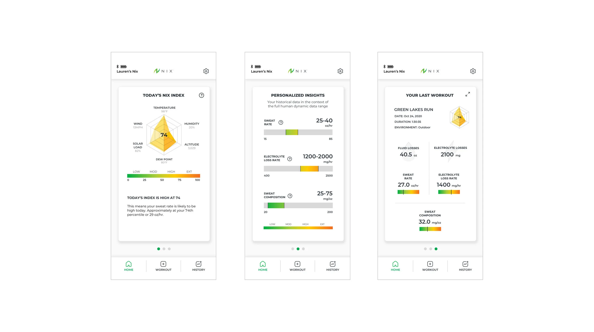
On the homepage, we created an ownable and comprehensive visualization of local conditions to show users what kind of sweat conditions to expect that day.
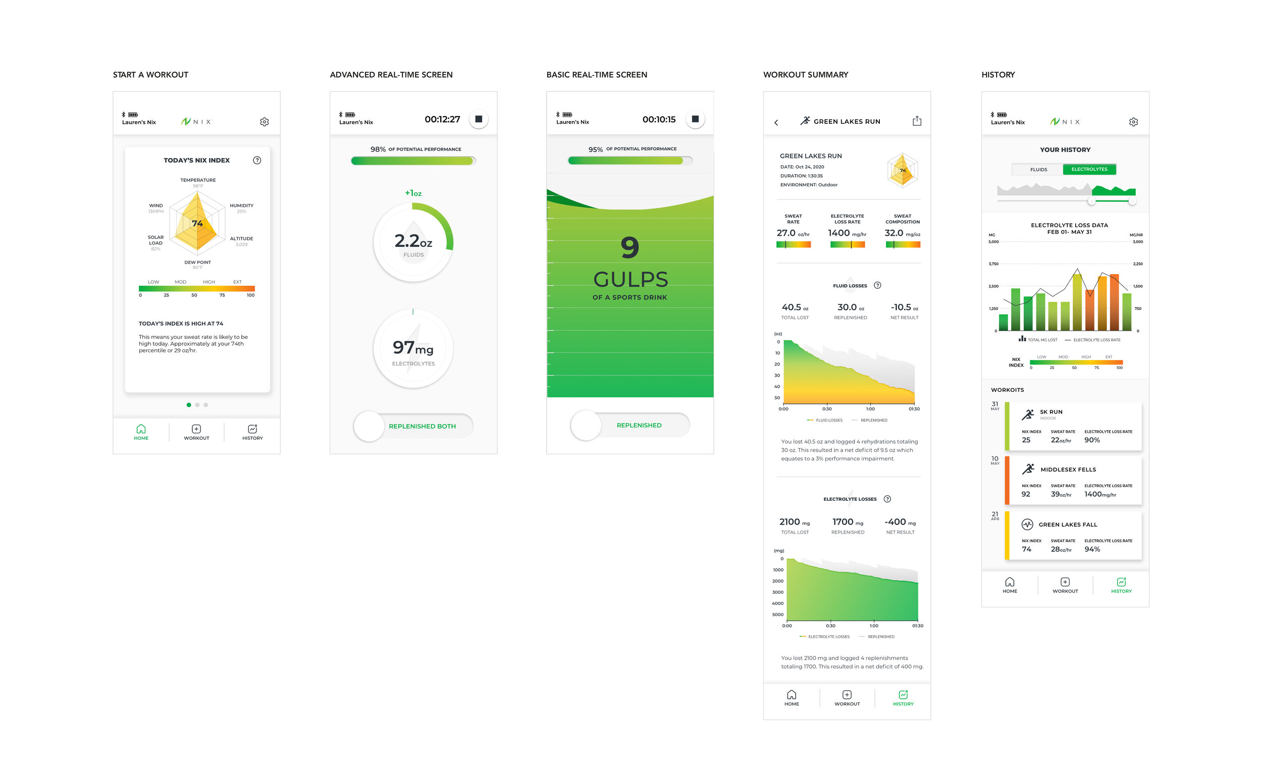
This spider plot graph was comprised of metrics such as temperature, altitude and wind, and created a composite number on a scale of 1-100 to give users data at a glance for what to expect form their workout.

Highlighting data: Hydration performance graph
One of the most challenging visualizations was a graph showing fluid and electrolyte losses during a workout overlaid with user-logged replenishment. At first, I combined fluid and electrolytes into one “hydration performance” metric that showed total losses (black line) against the colored line, which showed a lift when a user logged rehydration.
To simplify this, I separated the data into two graphs, changing the Y axis to ounces for fluids and milligrams for electrolytes, and used one line to show real-time losses of the workout. I used another line to show the total amount the user had replenished to make the graph scannable and easier to understand.

Offering two modes of detail
Originally, we created one real-time screen with fluid and electrolyte metrics. We soon realized that some users would want something simpler, so we created a “basic mode” that combined fluids and electrolytes metrics into one “gulps of a sports drink” number.
Users can customize push notifications for each mode by time intervals, performance impairment, or by number of ounces lost.

Final homepage
Instead of a long scrolling screen for the homepage, we created highlight cards. The first card is the current Nix index, the second shows personalized insights of where the user’s sweat metrics fall in the population, and the third is a summary card of their last workout.

Visual Design Screens
Here’s a look at the design system across key screens. We created cohesive data visualization by pulling in the colors of the Nix index into the workout summary and history screen so users could start to associate how environmental factors affects their sweat and performance. Through using Nix, athletes can better understand how to optimize their performance and learn to anticipate their hydration needs.

Next Steps
I’ve been working with a developer to hand-off and test the current designs to get ready for user testing with athletes.
After integrating user feedback, the team plans to make the Nix app compatible with Apple and Garmin watches, allowing users to see their hydration insights instantly, without having to interact with their phone.
What I learned
Make insights personal
Without proper context, data doesn’t mean much. Showing the user where they fall in the broader range of data makes insights much stronger and more compelling.
Simplicity is key
With data visualization, especially with novel or unfamiliar data, I learned it is critical to keep the visualization as simple and scannable as possible, only highlighting the main insights for the best chance of user adoption.


